Mini calendar in our JavaScript Scheduler can’t be named “little-known” feature and it’s some kind of “must have” in each appointment calendar. But in this article we’ll tell you about all the ways how and where you can place this small but very useful thing.
So, let’s start. First of all, we need to add the ext/dhtmlxscheduler_minical.js extension file on the page.
Then we need to decide where we would like to place our mini calendar. Pick up the variant that suits you and let’s add it to the scheduler (you can add the mini calendar at each of them).
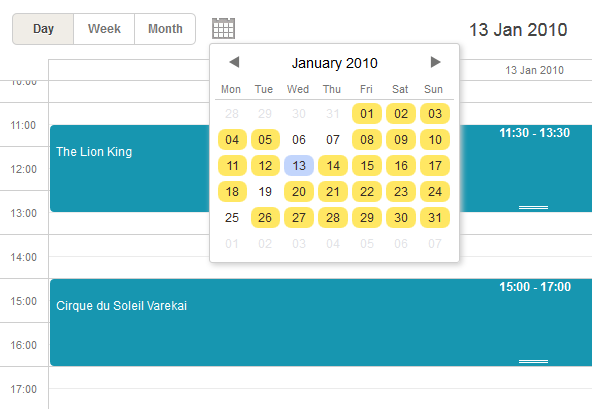
1. A mini calendar can be used for a quick navigation between dates of scheduler and be placed in the header
For this:
- Include the needed extension file as it was mentioned above;
- Specify the container for the mini calendar and add it to the scheduler markup:
- Provide the logic that should initialize (the renderCalendar method) and destroy (the destroyCalendar method) the mini calendar:
...
<div class="dhx_cal_date"></div>
<div class="dhx_minical_icon" id="dhx_minical_icon"
onclick="show_minical()"> </div>
</div>
if (scheduler.isCalendarVisible()){
scheduler.destroyCalendar();
} else {
scheduler.renderCalendar({
position:"dhx_minical_icon",
date:scheduler._date,
navigation:true,
handler:function(date,calendar){
scheduler.setCurrentView(date);
scheduler.destroyCalendar()
}
});
}
}
Check what you should achieve in the demo.
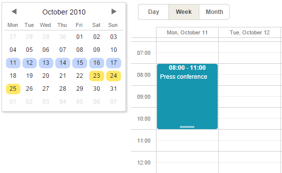
2. A mini calendar can be used as a user-friendly date picker for the lightbox

For this:
- Include the needed extension file as it was mentioned above;
- Set the type of the time section to calendar_time (instead of time):
scheduler.config.lightbox.sections=[
{name:"description", height:200, map_to:"text", type:"textarea", focus:true},
{name:"time", height:72, type:"time", map_to:"auto"}
];
//change type:"time" -> type:"calendar_time"
scheduler.config.lightbox.sections = [
{name:"description", height:200, map_to:"text", type:"textarea", focus:true},
{name:"time", height:72, type:"calendar_time", map_to:"auto" }
];
Check the demo to see the results.
Generally, the mini calendar can be considered as a separate component and used apart from the scheduler; you may bind a date picker to any input on the page.
This means that you can add the mini calendar to any place outside the scheduler.
Get learn how you can customize the mini calendar and also find out all the related methods.
Hope this article was useful for you. Next week we’ll continue to share the most interesting features providing by DHTMLX components.